What is Responsive Web Design?
February 23, 2016
Part 2 of this article can be found here.
As professional web designers and developers, we're more than aware of the importance of responsive web design and development; but as a small business owner, you may have only heard the term in passing. With this series of articles we hope to familiarize you with the concepts of responsive design and why it's vitally important to your business's existence on the web.
A Brief History
When we began creating websites in the early 2000s, our biggest challenge was managing web browser inconsistencies. The now-extinct Netscape Navigator 4 was the most popular browser in use. Microsoft had just rolled out Internet Explorer 6, unwittingly launching a decade of developer hair-pulling, teeth-gnashing, and fist-clenching. IE 5.5 still existed on the Macintosh platform, and Safari had yet to be released. The Opera browser, although not a new face on the scene, was rising in popularity. But with the exception of the nightmare that was browser consistency testing, it's not unfair to say that web development in those days was easy; sites were built entirely in tables, back-end platforms were limited, and Cascading Style Sheets were just a blip on the radar. We only had to worry about designing for clunky square CRT monitors, and only once every year did we need to check the statistics on popular monitor sizes and update our methods to reflect the ever-increasing screen real estate available to our users.
Enter the iPhone

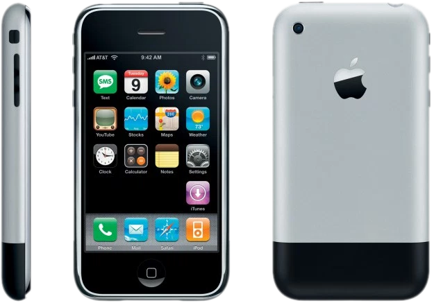
In 2007, the web development landscape changed drastically. Apple released the iPhone, the first widely-adopted smartphone with excellent web browsing capabilities, thanks in large part to the Webkit-based engine driving its mobile Safari browser. As it gained popularity and Android smartphones entered the fray, the design and development community quickly realized that though smartphones made the web accessible to anyone, anywhere, anytime, our current design methodologies did not translate to the smaller screens, forcing users to pinch-and-zoom and swipe-and-scroll and make frequent fat-fingered mistakes while trying to follow tiny text links. Recognizing a need for a mobile browsing experience targeted at these new devices, designers and developers began creating mobile websites that lived separately from their desktop counterparts. Hacky device detection methods were implemented to determine on the fly whether or not your device should be redirected to the new mobile domain.
This approach was effective for a few years, but eventually the field of smartphones, tablets, tablet/laptop hybrids, and touch-screen desktop devices grew too large to effectively detect. Should a desktop computer with a touchscreen get a touch-only experience? Does the small tablet device count as a mobile phone? And does the large mobile phone count as a tablet? What happens when a user rotates their device from landscape to portrait mode? Just what the heck is up with tablet/laptop hybrids?

The Responsive Revolution
In 2010, a web developer, author, and conference speaker named Ethan Marcotte blew our collective minds with an article entitled Responsive Web Design on the influential A List Apart blog. In short, Ethan demonstrated that through a combination of fluid elements (containers and images that adapt to a percentage of screen size) and a newly-adopted CSS3 rule known as a Media Query (more on that later), we could create "layout agnostic" websites. That is to say, a website that not only adapted to fit whatever screen it was viewed on - from the smallest 240-pixel phone screens up to the largest monitor and every size in between - but could go so far as to add and remove elements, paring down the site's content until only the most high-priority information was available to our users. Responsive design was the futureproof (nearly) solution to designing and developing websites that would work across the tens of thousands of devices and screen resolutions now in existence.
More to Come...
In Part 2 of What is Responsive Design?, we will dive deeper into the problems responsive web development solves, from mobile sales and customer conversion rates to mobile usability issues. We will touch on the importance of Google's recent decision that a well-tuned responsive mobile experience will affect your site's PageSpeed score and thus your PageRank, and the ever-increasing use of mobile devices for web browsing (over 50% of all web traffic and counting!) In Part 3, we'll give you some insights into how we design responsively, from traditional static comps to mood boards and style tiles; from pixel-perfect desktop comps to rapidly prototyped mobile wireframes. We'll discuss why a "mobile first" mentality has been undeservedly maligned. We will delve into mobile navigation and the contentious "hamburger" menu icon, responsive image solutions for increased mobile performance, responsive text using the newish Viewport Units, and the difference between Adaptive and fully Responsive design methodologies. Finally, we'll give you a look at Level8's browser and device testing methods, from VMs to BrowerStack to our in-house device lab.


